8 Practical Tips for Arranging Your Living Room Furniture
February 1, 2021
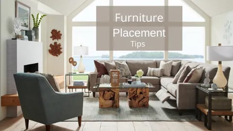
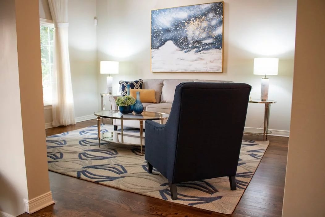
Arranging your living room furniture can be an intimidating task, but it’s a crucial step if you want to create a functional and cohesive space. When we say arranging furniture, we’re referring to all the components in your living room, from sofas and chairs to lighting, artwork, accessories and area rugs.
How do you incorporate all your home furnishings and tie them together for a seamless look?
To ensure you’re creating the most practical and visually pleasing space, Interior designer Zeina Badawi outlines our top 8 tips for arranging your living room furniture.
Eight Tips for Arranging Living Room Furniture
- Begin with a Plan
- Choose a Focal Point
- Allow for Conversation
- Scale & Proportion
- Identify Traffic Flow
- Selecting the Right Size Rug
- Proper Lighting for your Living Room
- Hanging the Right Size Artwork
1. Begin with a plan
Many of us tend to shop for and select the furniture we love without making a plan. Then, when all the pieces start to arrive, the task of finding a spot for everything becomes overwhelming. Then we begin to worry about how the couch will fit? Is the bookshelf taller than you remember? Does the coffee table overpower the room? What about all these beautiful accessories?
Think about the pieces you need before you choose the pieces you love! It’s easy to pick up an item and be drawn to its visual appeal without really considering what you will use it for and where it will go.
Consider how the room will be used before deciding on the number of pieces you need to buy.
What kind of mood you would like to create in your space?
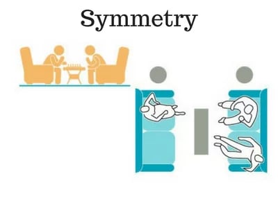
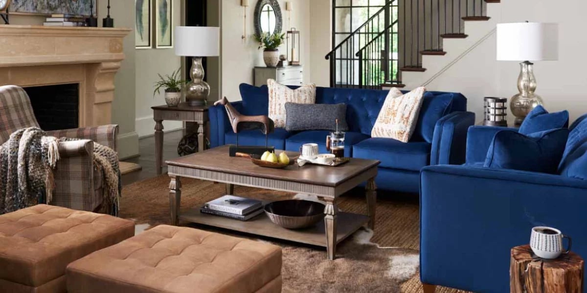
If you’d prefer a more formal, elegant, casual or glamorous room: a symmetrical (one side is a mirror image of the other) furniture layout would be best.
If you’d prefer a casual, cozy or playful mood? Then consider an asymmetrical layout.
The kind of mood you are trying to achieve will help guide you to the right style and colour scheme.

2. Choose a Focal Point
Whether your home is blessed with natural architectural features or a large blank canvas, a focal point is a must in every living room. Your eye needs a place to land so if the room has a large picture window and a view or a lovely stone fireplace then you are set.
Otherwise, you’ll need to create your own focal point, something to draw your guests into the space. Try textured or patterned wallpaper to make a feature wall or a large mirror. Using a grouping of your own living room furniture can also work as a focal point. Finish off the room with a beautifully coordinated area rug.

3. Allow for Conversation
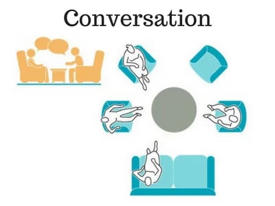
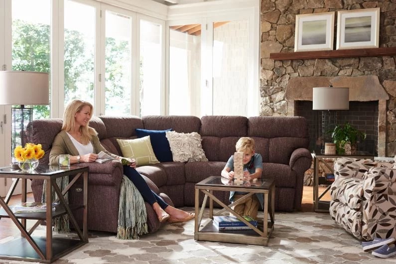
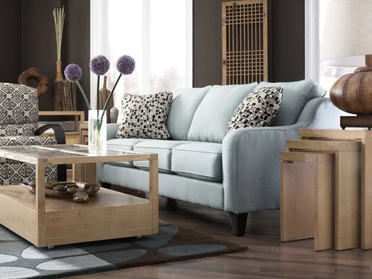
A conversation area consists of seating arranged in a way that encourages conversation. You want to create a cohesive look while making conversation in the room comfortable. The last thing you want is for your guests to have to yell across the room to be heard!
The conversation area can have several different looks and is ideal for rooms without a television.
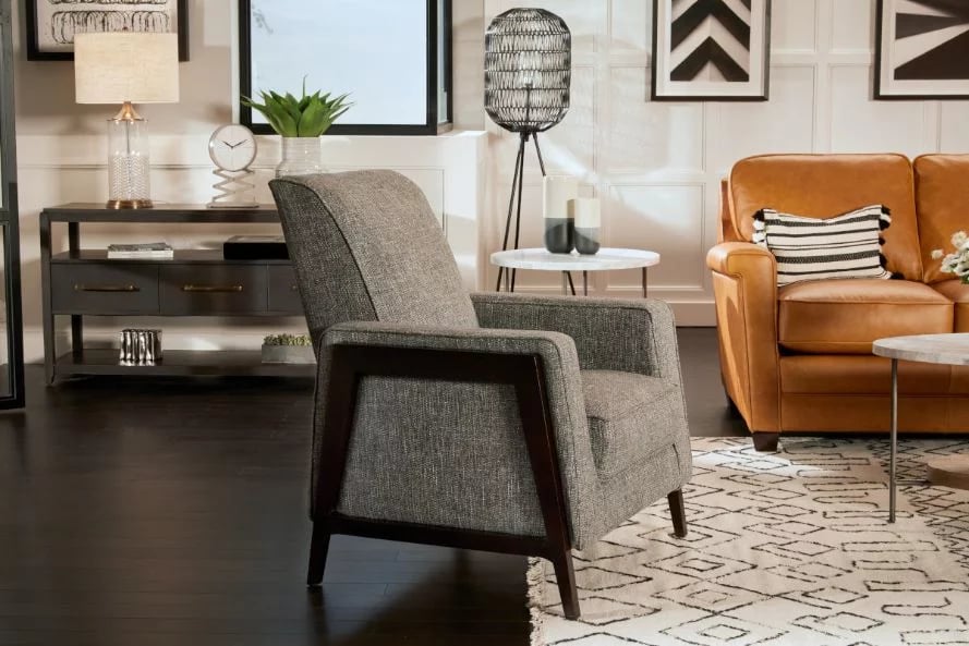
- A sofa and two accent chairs surround a coffee table.
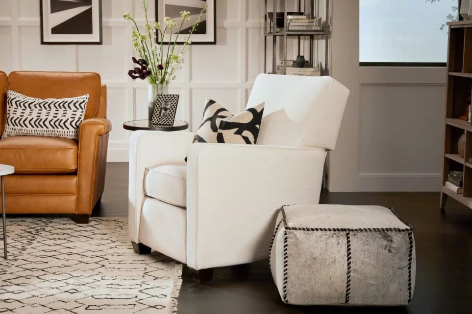
- Two – four accent chairs grouped around a coffee table or ottoman. (The Ottoman doubles as an extra seating area or table.
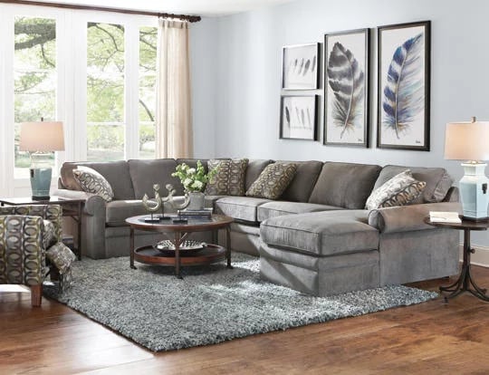
Or suppose you have a large space, try creating a conversation area in the middle of the room; a designer sectional that seats 5 or 6 works well. If the room is extra large, consider two or more conversation areas.
4. Scale & Proportion
Balance is essential when arranging furniture in your living room. You don’t want to have all your big pieces at one end and all your smaller pieces in another. You want the room to feel symmetrically proportioned.
The right scale in any home is what makes you feel cozy and relaxed. Match the proportion of the furniture (tables and art) to the size of the room. This helps create the right balance and feel in your space
Size
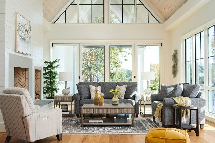
A large scale room can handle larger furniture; the higher the ceiling, the taller the furniture pieces can be and vice versa. Make sure to choose the furniture of the same scale as well. An overstuffed sofa with a tiny side table may look awkward next to each other.
White space
Remember to leave white space in your room. Less is more! The eye needs room to rest somewhere. Leave some empty areas on the wall and in-between furniture.
Patterns
The pattern rule is similar to the size rule! The smaller the room, the smaller the pattern and the fewer number of them we can mix. To learn more check out our article Four Tips on How to Mix Patterns.
If something doesn’t feel right, it probably doesn’t have the correct scale or proportion for the space. Remove, relocate, or replace anything that doesn’t fit until the room that you desire is complete.
5. Identify Traffic Patterns
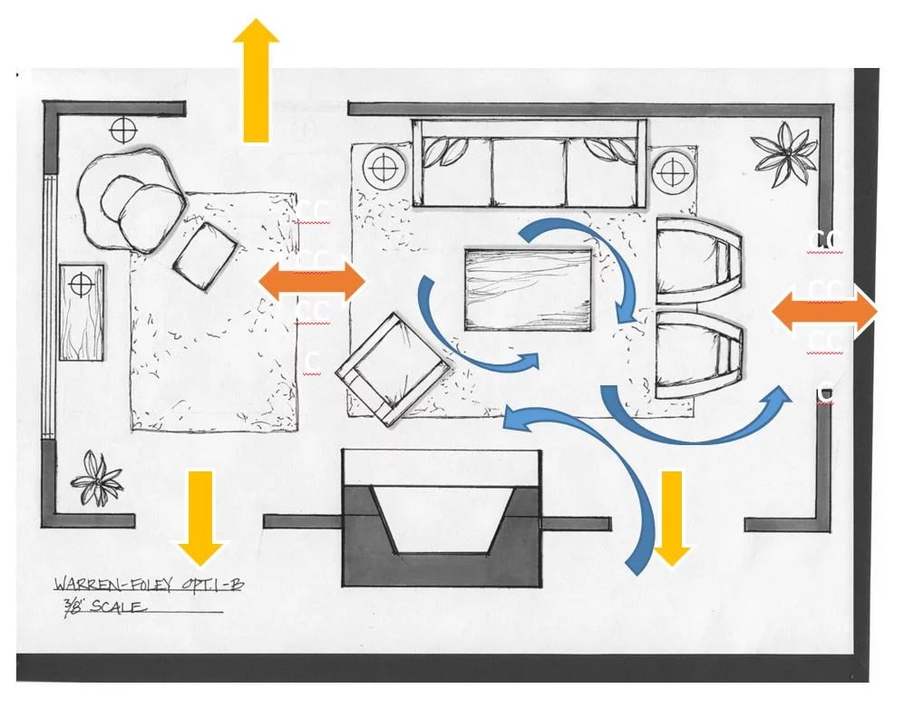
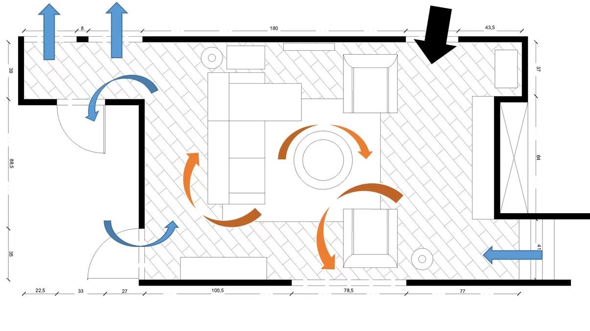
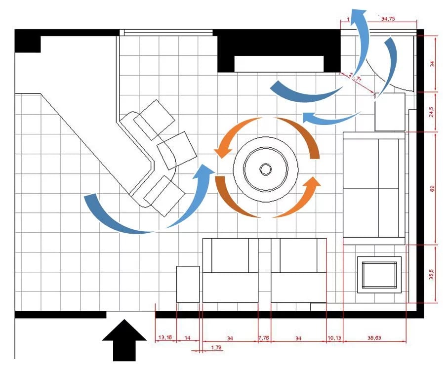
Good traffic flow allows the room to be used and accessed easily. Consider the way you move through the space as you live in it and pass through it. Typically, traffic flow will begin at the room’s entry door and continue through to a secondary exit or entry into another room.
Coffee tables or ottomans are in a position so as not to cut off or block movement. The recommended distance between the sofa and the center table should be at least 18 inches with no clearance (allows for walkthrough traffic) and around 36 inches, including clearance. A family room designed for wheelchair users has to have space that allows for wheelchair movement. It should also allow for a 360-degree turn in their chair.
In a living room with the tv located on top of the fireplace, people usually spend hours sitting, which requires a comfortable sofa with good neck support. A good option for this room would be a reclining sofa. If you go with this option, you will need the space as it requires clearance of at least 20 inches for the footrest.
Depending on the model, it will also require six inches to one-foot clearance behind the sofa. *remember, you will need the extra space it requires for space when reclined.
Take a look at the examples below for different traffic pattern ideas.
6. Select The Right Size Area Rug
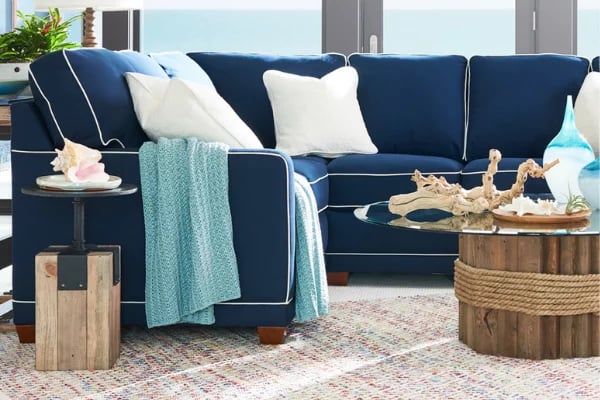
When choosing the right size rug for the room, you have to keep two things in mind: the room’s size and the configuration of the furniture.
Sometimes we’re limited on the size of the carpet we can use because the room is small. Other times you don’t want to cover up all the hardwood because you love the look of it.
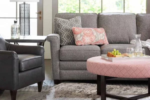
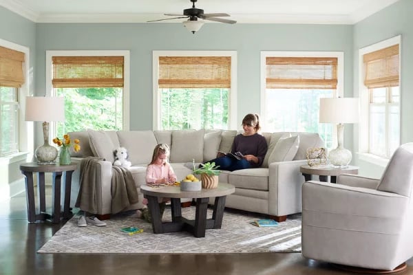
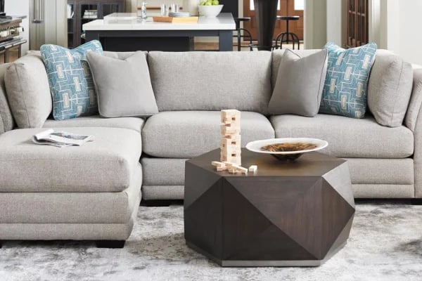
If the room is rectangular, don’t use a square rug. Use a carpet that’s proportional to the room size. If using a rectangular shape rug, place the long side parallel to the room’s long wall.
Three Ways to Position Your Rug:
- No furniture legs on the rug.
- Use a rug that’s a bit smaller and has only the front legs of the furniture on the carpet.
- Extend the rug underneath all the furniture legs.
When all the furniture has its front legs on the rug, it creates a conversation area. If the carpet is smaller and the legs are off the rug, it makes the room look busier and smaller. If the rug is partially under the furniture, the floor appears to expand scale-wise, making the room look bigger.
7. Add the Proper Lighting to Your Living Room
Pot lights and most ceiling-based lighting are at best insufficient for a finished living room.
Pot lights or recessed ceiling fixtures are a common renovation choice and are often included as a highlighted feature in new homes. They are relatively inexpensive to install and run.
Plus, recessed fixtures offer the ability to throw a massive amount of visible light over a great expanse.
The downside is that recessed light fixtures do not offer the best lighting for specific tasks common to our living rooms; nor are they a flattering light for “ahem” ladies over a certain age.
Pot lights highlight every facial flaw and offer a harsh colour tone. Even when placed on a dimmer to control their aggressive lumens, having an unfiltered light source directly overhead can stress and contribute to eye fatigue.
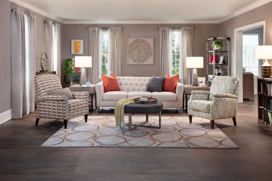
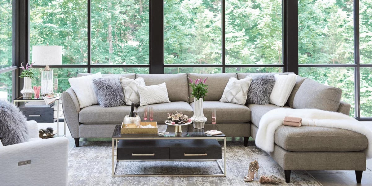
Table lamps correctly chosen for a finished living room will add an inviting gracious ambience to your space. The filtered light quality will help create a warm and relaxing place for you to share with your guests.
For a more detailed explanation of why table lamps are the best choice for your living room and tips on choosing the right ones, have a look at How to Add Light to Your Living Room with Table Lamps.
8. Hanging the Right Size Art
Begin your process by analyzing your available wall space. Generally, a smaller piece of art looks better when “contained” on a smaller wall. This could be a space between a door and a window or a small stem wall. You can admire smaller pieces better when you stand closer to the artwork.
Your more significant expanse of the wall will demand either a larger piece or a collection of smaller pieces, which will read as a unit.
When you are satisfied with your artwork’s layout, you will then need to attach each piece to the wall.
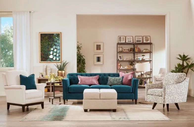
One crucial element is the height at which the painting hangs on the wall. Most artwork is best viewed at eye level, 58″ from the floor to the centre of the piece or centre of the grouping of art. If it’s hung above a sofa, it can be 4-6 inches above the piece. Exceptions to this rule are pieces placed over a doorway, in a stairway or above your fireplace.
For more great tips on hanging art in your living room, check out our Tips on How to Hang Your Artwork… Properly!
Next Steps
If you require assistance, La-Z-Boy Ottawa and Kingston offer complimentary interior design help. We’re a “one-stop-shop” with everything you and the designer need to create a beautiful home.
Our in-home designers have the expertise to guide you through the process and help you create that space you’ve always wanted.
With La-Z-Boy’s design service, there are no extra fees.
If you are interested in meeting with an interior designer at La-Z-Boy, visit us at one of our local Ottawa or Kingston locations or book a consultation online.
We look forward to meeting with you and helping you bring your interior design visions to life!
Product Info Request
Please provide us with your name and email and we'll get back to you as soon as possible regarding this item.

